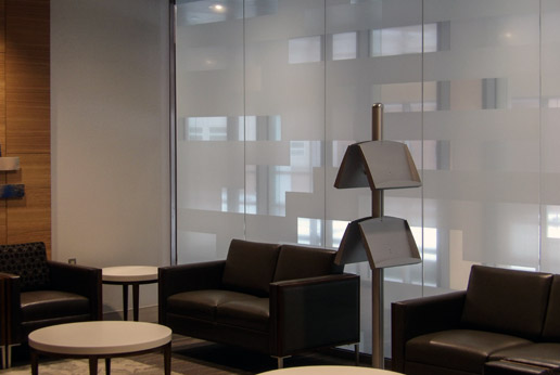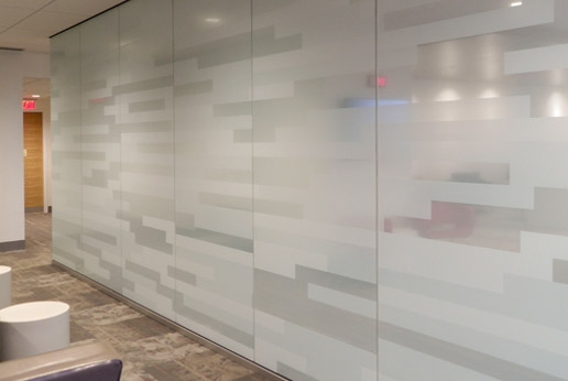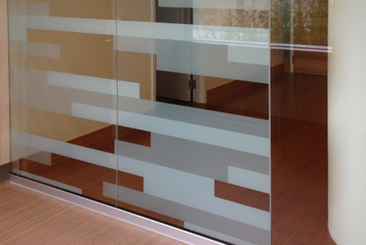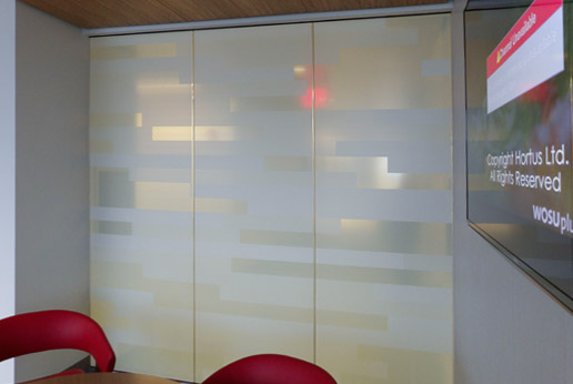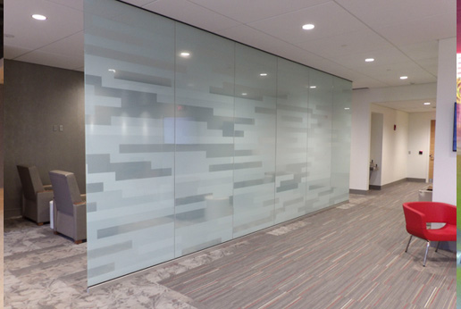
Larger Bars – clear areas are muted with 5% white because the walkway on the opposite is so busy. If the clear areas were crystal clear then the waiting room and walkers would constantly try to make eye contact.
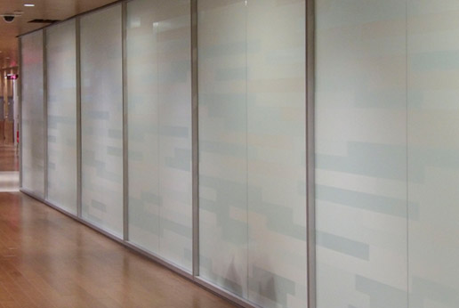
Smaller bars – the hospital has a large open area split by a wall of glass. On one side, a sitting area was designed while on the other a merging of several walkways. The glass helps provide visual shade from all the activity.
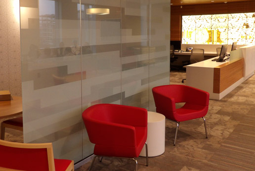
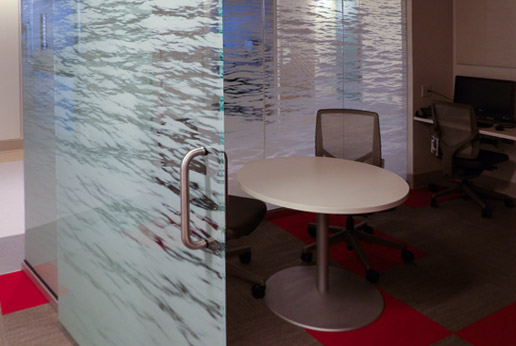
Another separator using Smaller bars and 5% clear areas. The tables are used by visitors who need to complete office work. The red chairs designate the area for visitors who need a comfortable area to await friends and family.
On the opposite is a lobby with 4 very busy elevators. This wall helps divide the common area and the very public elevator.
Translucent bars printed on crystal clear film allows for full coverage an no edges patients can pick at.
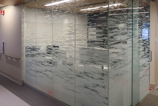
Mirrored Lake – where the darker room enhances the white print. Nurses can still work in this room and see the patient rooms they are responsible for.
Patients can see into the nurse’s area but reading monitors or charts is difficult as the print creates enough visual distraction for privacy.
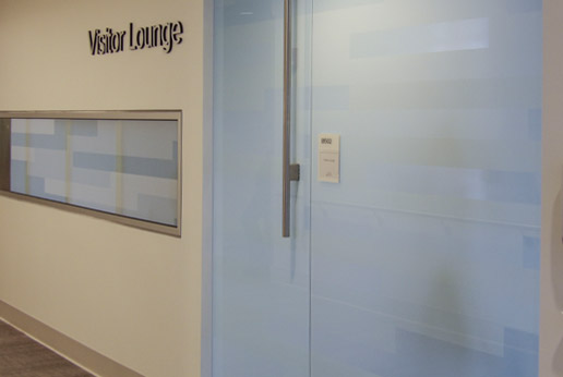
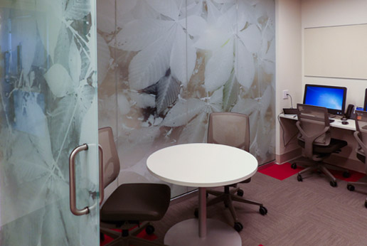
Each Visitors Lounge included a kitchenette, a modified living room and modified study area. The swinging door and prints made for visual and audible privacy.
Many an hour can be passed here comfortable as patients are receiving treatment.
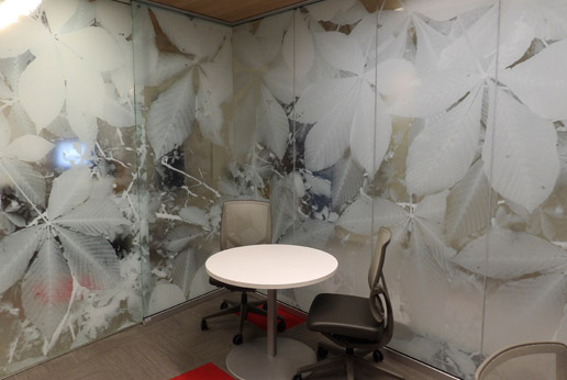
The Buckeye print is similar to Mirror Lake and most of the art team liked working on this one best. We believe the organic print looked great.
Same space looking out. A nice amount of privacy is offered which still leaves staff readily accessible.
