HDFade – double-fade and clear knockout elements
If one were to consider foreground art and background art, then the two element application makes more sense. Backgrounds are supposed to be subtle and HDFade is used to this effect. We are accustomed to HDFade being used as the backdrop for corporate glass and often enjoy the special effects designers apply to the foreground art.
The foreground is supposed to be bold but not overwhelming. Often, corporations use foreground art to use branded elements but avoid an actual icon.
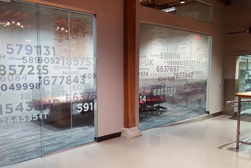
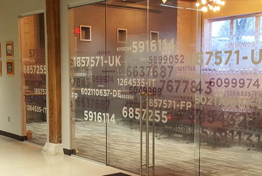
This project gambled, doubled down on the background project, and walked away with a win. The background has two elements; a double-fade and clear knockout icons.
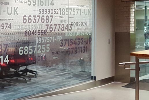
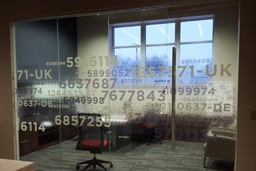
If one looks closely, the corporate icon was patterned and looped over the double-fade. Had just the background been used, then there would have been very little privacy. The double fade would have kept people from walking into the clear glass, but the clear knockouts would have made eye contact very easy. Clear glass often makes employees feel like they are in a fishbowl, especially with the human need to make eye contact when a person moves into view.
A double-fade would have countered the ‘fishbowl’ experience; a double-fade with clear knockouts would not have.
Which means the foreground art needs to provide enough ink to provide privacy. The client used patent numbers that corporation had earned. They were proud to display what gives them a competitive edge.
By alternating the sizes and colors of numbers, they created a foreground just heavy enough to offset the clear knockouts. The end result was an excellent artistic endeavor – utilizing three elements and two separate corporate features which have deep meaning.
This is our favorite this year because of the use of clear knockouts. The artist reminded us that clear could be used as an design element. The absence of ink, when used effectively, can contribute just as well as translucent ink.
- HDFade
- Optically Clear Window Film
- Window Film Design

