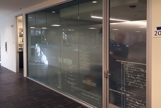
Conference Room privacy with style
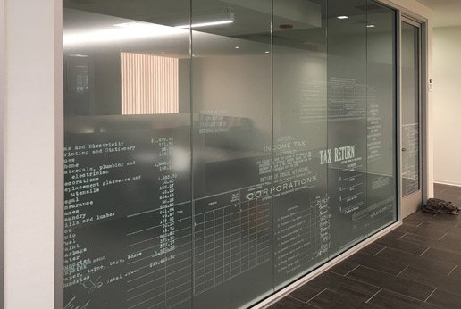
Accountants with whimsy! With the heavy use of computers, handwritten entries offer a bit of nostalgia and showcasing this with a conference room passes a message to new clients “Aren’t you glad we don’t do this by hand anymore?!?”
Who knew pocket-protecting, calculator-carrying, number-crunchers could make spreadsheets and financial statements look good? With the background as HDMist and the foreground art as HDWhite, this conference room now has privacy that looks great! Special note – the art file was not provided at the highest resolution. We offered to tighten and sharpen the script.
The client was offered a digital sample of both options and preferred the lower res file because it made the art feel ‘aged’. This was nicely done and showcases how any given industry can have a neat impact on graphics.


