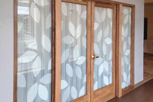
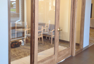
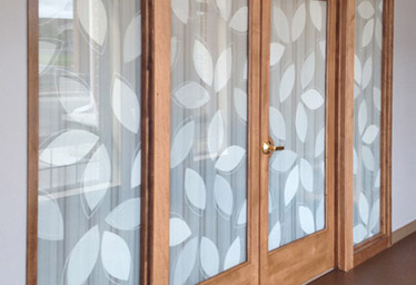
This project is one of our favorite HDWhite before and after pictures.
We learned a lot on this project. There were probably 20 emails going back and forth trying to determine the percentages of white to use. Occasionally projects will see back and forth while two art teams try to find a figurative middle ground.
Another issue with this project was trying to solve all the issues at ones. There are three white stripe translucencies and three white leaf translucencies.
Effectively this project should have been broke down into two phases: Background and Foreground.
As soon as we did this the Background stripe pattern was solved and HDClear art teams were released to print a background sample. The strip pattern was approved and we moved on to the leaf pattern.
The leave size was easy to dial in the translucencies, however, were not. One of the most common issues popped up – the confusion between translucencies shown on a computer screen and translucencies provided on glass clear film.
Monitors project light at the eye. White printed clear film reflects light at the eye. Interesting point, both have similar values when bright but drastically altered values when determining lower translucencies. What looks 15% on the computer looks like 35% in the hand.
Confused? Exactly!
Our sample book provides overlay translucency values. We provide this in White Scale, Greyscale and in any CMYK scale. The overlay percentages are called out. Variations on this are possible but there are costs involved and conversations which require direct communication with the client’s art team.
One of the reasons we offer confidential art services is there are times when two art departments can speak to each-other much simpler than if two salesmen are filtering the communication.
Everyone walked away from this project and was pleased with the outcome. We made changes to our sample book and art processes to help mitigate the recent confusion. Our current approach helps specifically with single-color, overlay translucencies.
- Please review HDClear Sample book Overlay pages when considering projects with mixed translucencies
- Trying to create the perfect graphic on the first try was a bad idea. We were successful when we slowed down and broke the project into manageable steps helped with clarity. First we addressed the background and earned a signoff. Second we managed the foreground art and earned a signoff.
- There are times when slowing a project down is the smart move. We could have lost the client and the project. We accepted responsibility, made intelligent changes to project management and kept the client and the end-user happy with us.
- Custom Printed
- HDWhite
- Optically Clear Window Film
- Window Film Design


